for real, for real.
Building a body-care brand by treating skincare more like food.
The starting point
This didn't begin with a brand. It began with something I was already making at home: a waterless moisturizer from four raw ingredients, cocoa butter, coconut oil, shea butter, extra virgin olive oil.
The obvious move was to make it look like skincare, neutral colors, botanicals, apothecary bottles, clinical language. I decided not to. If the ingredients are the product, why hide them behind the beauty aisle? I didn't want to sell purity. I wanted people to understand what was in the jar.
The category shift
Pantry.
Nut butter, jam, specialty groceries, produce stickers, food makes ingredients feel joyful instead of scientific: oversized type, unexpected color, packaging that doesn't apologize for what's inside. That was the first strategic decision, and it determined everything after it: treat the moisturizer like a food product for your skin, not another object from the beauty aisle.
Object, identity, label
A raw jar, a loud name, a package with behavior.
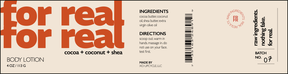
A wide-mouth amber jar, not an airless pump, makes the product physical: you scoop it, warm it in your hands. The name does the rest. "for real, for real." sounds spoken, not invented by an agency, so I treated it as graphic material, oversized enough that the jar can barely hold it, cropping and wrapping around the circumference.
That became a continuous wrap label instead of a front and back. As the jar turns: identity, then ingredients, directions, batch, provenance. The regulatory copy isn't hidden, the information is the graphic. It isn't designed to have a single front. It's designed to be handled.
Finding the world
Skincare for people who use their skin.
The campaign
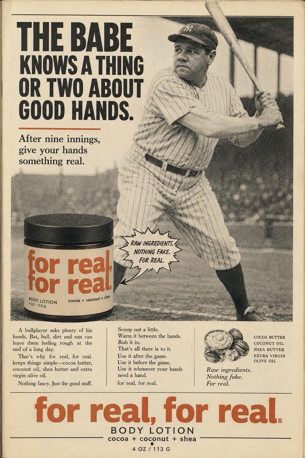
What if it had existed in Babe Ruth's era?
A fictional period ad, built as if found in an old magazine, dense copy, coarse halftones, engraved illustrations, with the modern jar sitting inside it. The collision was more interesting than a retro campaign, so the archive became the architecture of the whole digital experience: it opens on Babe at bat, moves to a huge crop of hands (dirt, sun, chalk, leather, sweat), then drops the history so the product stands alone, "nothing fancy, just the good stuff."
Halfway through, it winks at itself, "Okay, we weren't around in 1932. But cocoa butter was." And it doesn't end with the Babe, he's the way in. The real line is "you don't have to be the Babe. You just have to use your hands."
The system
Each decision created the conditions for the next.
What began as four ingredients became a connected system. The important outcome wasn't any single artifact, it was that every choice narrowed and opened the next.
My role, and where it stands
Concept, strategy, creative direction, packaging, copy, product art direction, campaign, and digital direction. I used generative tools throughout to prototype packaging, photography, and the historical world fast, but AI was a production medium, not the source of the strategy. The decisions stayed human: why food, why amber glass, why hands, why baseball, why history as interface rather than decoration.
This is a concept-stage brand and commercialization exploration, not a launched consumer product.
The next phase moves from a simulated brand world into physical validation: jar sourcing, final formulation, label-compliance review, print tests, photography with real samples, consumer testing, pricing, and a limited first run. Only then does the campaign become a launch.